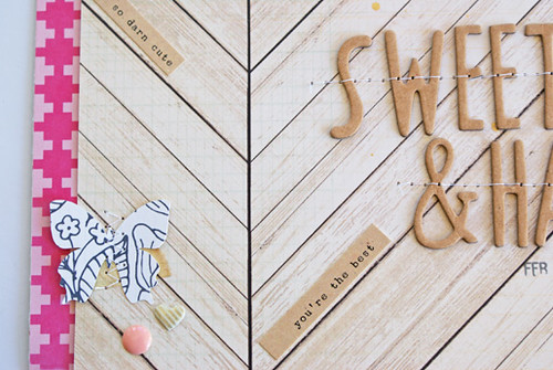
Lately I have been following a few online discussions related to background choices for layouts and it has really made me think about my own. For awhile now, I have been doing the majority of mine on a white cardstock base. I like the way color pops off a white background and the "clean" look that a white based layout has. I also see lots of white in online galeries and can certainly say its a common trend. My second most used type of background is patterned paper. I am particularly fond of using any sort of neutral or natural looking patterned paper such as the woodgrain paper from the
Hip Kit Club March Kit that I used in this layout:
One of the pluses of using a woodgrain or neutral patterned paper is that is will go well with the other colors that you choose to work with. I chose the pink plus sign paper and it really jumps right off of the page.
What kind of backgrounds do you like to use for your projects? Do have an automatic go to background or do you mix it up? After writing this I am thinking that I might need to branch out a bit from the white and do more with patterned paper and colored cardstock.
Wishing you a great day!
Michelle


Pretty photo. I love the pink plus sign paper with this background. What I use for a background depends on what I want to try. I'm still kind of new at this. Lately it's been kraft or a cream color, and light gray. But I did recently use patterned paper as my background. Michelle t
ReplyDeleteI also read a thread were many people said (in more polite words) they hate white backgrounds and make think too. I understand when they say everything looks pretty equal, if you see all of them together they do look equal even though they are different. Anyway I love working with white backgrounds I found it easier and I like how the photo pops with the white.
ReplyDeleteI fun to see how people can dislike what you love LOL.
beautiful layout by the way!
Darling layout, Michelle, the wood grain looks great with the pops of hot pink! The majority of the time I use patterned paper, but there is something to be said about a clean, sharp white background. :)
ReplyDelete