I think this new attitude first came about with the entire revamping of my PL style/format (will be addressing this in an upcoming post) at the beginning of the year. Since then I have been absolutely shaking up my usual scrapping routine (for example, I have a 2 pager in progress! What!?) and it is EXCITING. Honestly, I have a new vigor for scrapping and it feels great.
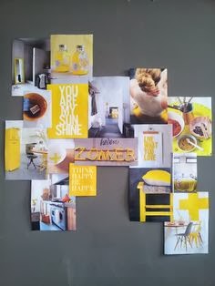
This layout is a product of this new outlook. Previously, I had been so stumped when it came to design prompts that had nothing to do with scrapbooking. Things such as magazine ads, images of shapes and objects, quotes, ect. I wanted to use them, to understand them. I even created a board on Pinterest solely for the purpose of collecting these items. And as many collections do, they stayed there unopened and unused. Until recently.
After being at a loss as what to do with a particular picture, I opened my board, browsed through the images, and bravely picked one that I thought might work.
BUT after thinking about it with a scrapping perspective, I noticed that the design elements used were ones that I am familiar with. First, it's a very loose version of a grid. Second, there is dimension, with some elements popping off the background. Third, there is a lot of white space. With these in mind, I made this:
Fun stuff! I am so glad I went outside my comfort zone and now that I am thinking about it, anytime that I have ever pushed my limits I have rarely been uphappy with the results. And this goes for every aspect of my life. Funny how a little thing called "fear" can excercise so much control over one's actions.....maybe I should be kicking "fear" to the curb?!
Wishing you all a great day!
Michelle


Cool page. Love how you were inspired!
ReplyDeleteLove your page! You should kick fear out to the curb! LOL! You're doing great! I did with my fear of mixed media and ended up on the Faber Castell GDT for a term!
ReplyDeleteYour page turned out awesome! It's so fun to experiment with new things sometimes, and Pinterest inspires me on almost a daily basis :D
ReplyDelete