Hello and happy Tuesday! Do any of you all have a favorite project or layout that you like to do? Well I do! My favorite layouts to do are the opening pages to a new album. Let me explain: I keep several albums-a "main" family album, albums for each of my kiddos, and a personal album. The family album and my album all begin with the new year and the kids' albums are organized by year. So each year I have five opportunities to create opening pages and I really look forward to making them.
There is something about a brand new fresh start that just makes me happy. I also like that the opening pages set the tone for the new year as well as serve as sort of a celebration for that particular person. I also use these beginnings to re-evaluate how I am going to document that year. For example, with my oldest daughter I have decided to go ahead a dedicate a certain amount of album space per each month. Since her birth I have filled two albums a year for her and to be quite frank, the amount of albums (so far 12!) is starting to concern me a bit and I thought that it might be worth the effort to try to limit myself to one album for her seventh year. I'm not planning on cutting down on the number of stories that I document, instead I am going to increase my use of pocket pages and limit the traditional style layouts. This way I can get more in in less space. Hopefully.

My opening pages almost always contain a combination of a pocket page and a layout. The pocket page is smaller that the 9x12 layout because I like being able to open the album and see "layers" of layouts and that is what I did with here with Maleia's newest album.
I went with a pastel color scheme to compliment the single photo on the page. As is usual for my pocket pages, I kept the embellishing simple. My last addition to this page was an Avery tab at the bottom.
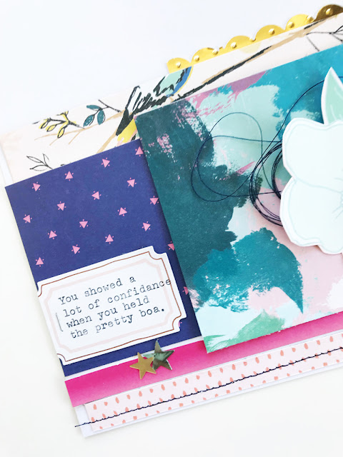
One of the changes to my plan for her album this year, is to include more typewritten journaling. My goal with this is to get more words into the album. I will often hand write my journaling on a traditional layout, but I am never quite satisfied with my handwriting on journaling cards or labels which translates into less writing in the albums. I think this is because my handwriting isn't quite "clean" enough and doesn't match the simple and neat aesthetic I like my pocket pages to have. The typewriter solves this issue for me.
My traditional 9x12 layout was so much fun to put together and I am really happy with how it turned out. I combined a recent kit from Studio Calico with some of Maggie Holmes' latest collection and came up with a layout that I am quite proud of:
I went for my favorite type of layout: layered with scattered embellishments. I also made sure and used a lot of gold.
Now this might be an entirely weird thing to admit, but up until very recently I could not combine hearts and stars on a page. I don't know where I got it in my head that I could not mix the two, but I think I am finally moving past this little hang up!
Thanks so much for letting me share these pages and my thoughts with you!
Michelle


