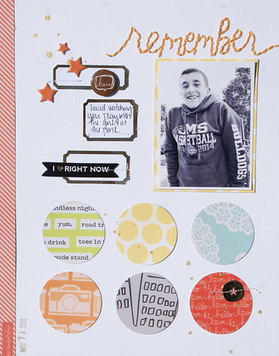
The layout sketch was based off of this 12 x 12 layout by Elizabeth Kartchner. What drew me to the sketch was the possiblity of using multiple patterned papers and colors. I generally scrap with three colors and a neutral and I saw this as an opportunity to do more of a "rainbow" color theme.
One of the reasons I have a hard time attempting a multi-colored layout is that I often feel that too much variety can clash with the pictures. Now, I know this is just a little quirk of mine and I should just let it go, BUT this picture, in its full, colorful glory, did not go with the colors I wanted to use AT ALL. Thanks to my son's undying love of his royal blue sweatshirt, I am often confronted with this problem. Since I was set on the products I wanted to use, I did a quick and simple edit to my photo by converting it to black and white in my PicTapGo app on my phone. Problem solved.
I changed up the sketch a bit to better fit my layout size (8.5 x 11) and the vertical photo and loved the results. It's a simple, uncomplicated layout--a style I am finding myself gravitating towards lately.
Wishing you a great day!
Michelle


No comments:
Post a Comment