When trying something new, I often take inspiration from scrapbooking galleries and pinterest, Double page sightings are rare though. I am certainly seeing more than usual, but there still is not a great deal to pull from. So when I set out to design a two page layout, I really had to start from scratch.
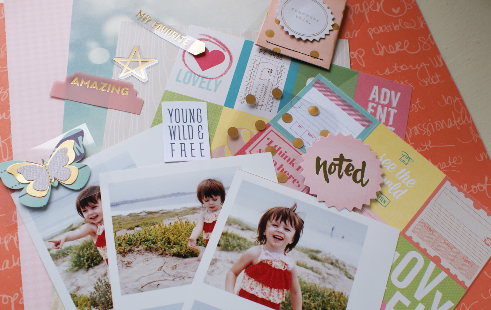
I started first by narrowing down a color scheme. Beside complimenting or highlighting photos, color can be used to unite multiple pages. These are the products I pulled from the various August kits.
From this I narrowed my color scheme down even further to pink, red, gold, and a few neutral pieces in beige and gray.
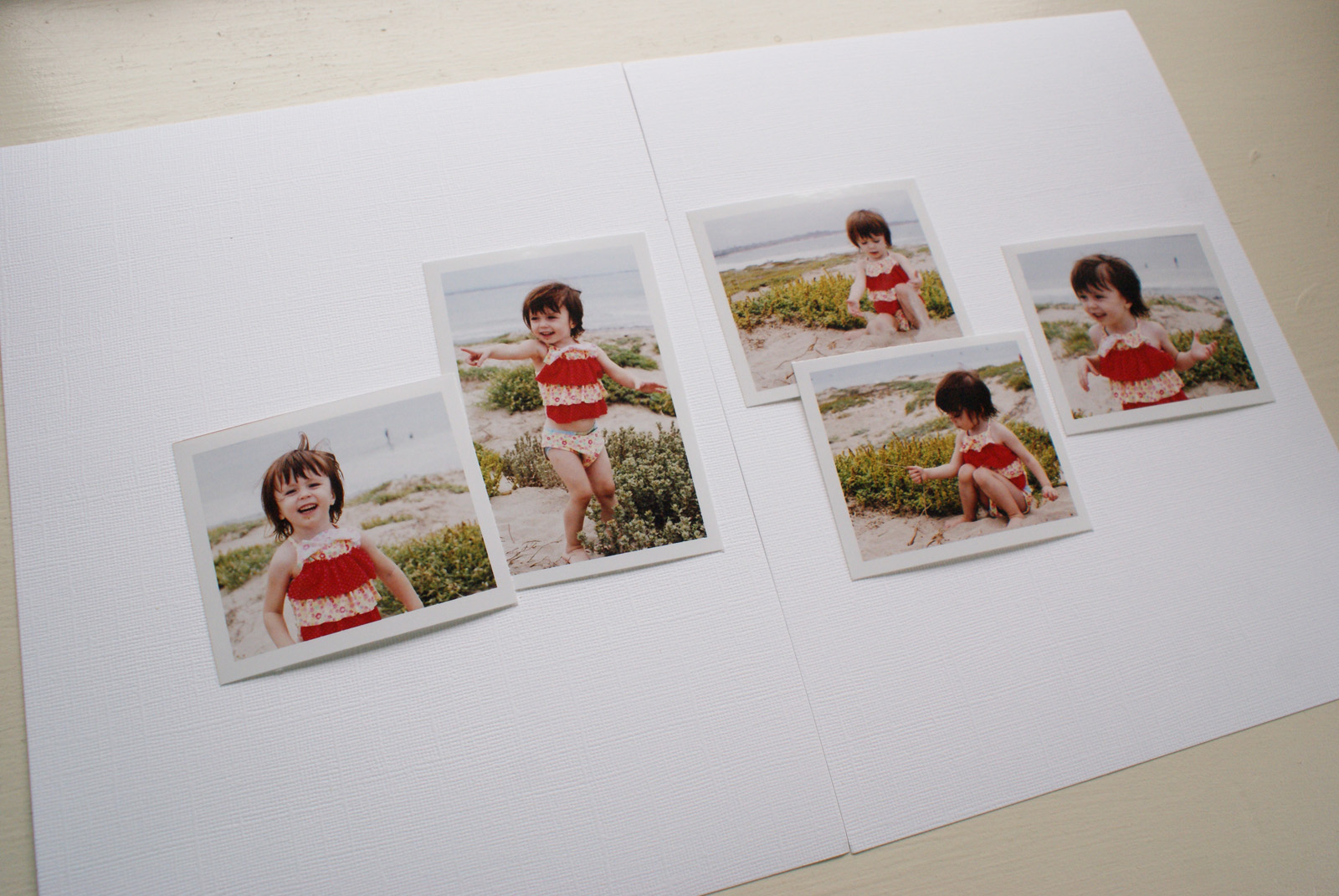
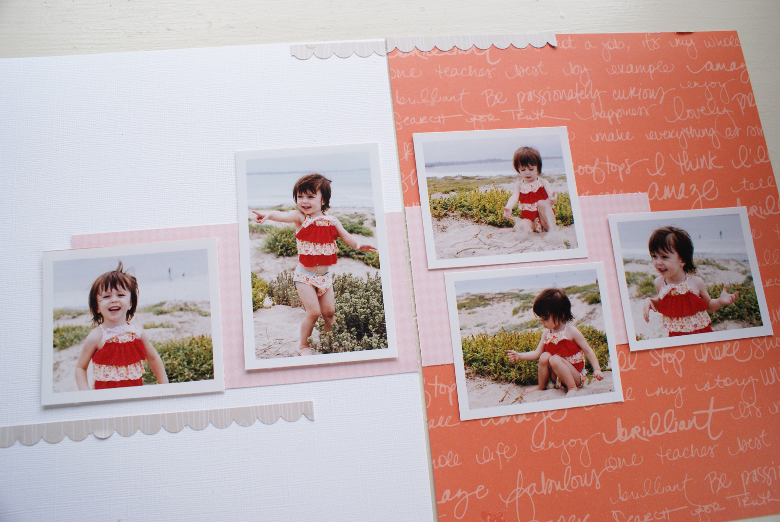
Next, I spread my photos across the two pages and played around with the arrangement. To keep it simple, I printed all but one of my photos the same size and went for a symetrical design to balance the photos on both sides. Here is what I decided on:
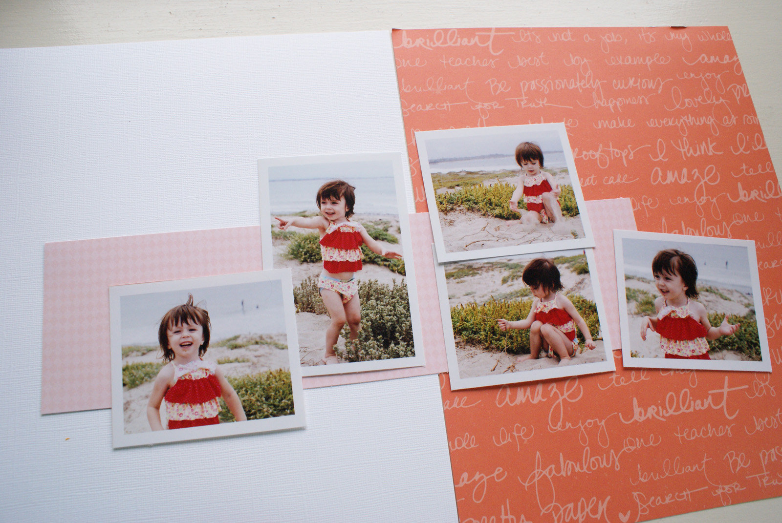
Now that I knew where I wanted my photos to go, I began to build a background. Since I absolutely loved the red patterned paper from the August Main Kit, I decided to be bold and use it as one full side of my design. I then cut a smaller pink rectangle to spread across both pages, bridging the two pages.
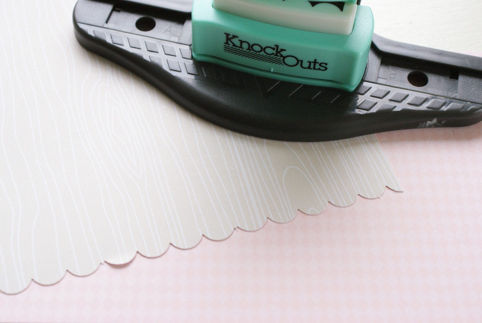
To coninue with the process of unifying my layout, I cut a border strip in a neutral beige from the 6x6 paper pad included in the PL Kit and placed it across the top of both pages, making sure they lined up.
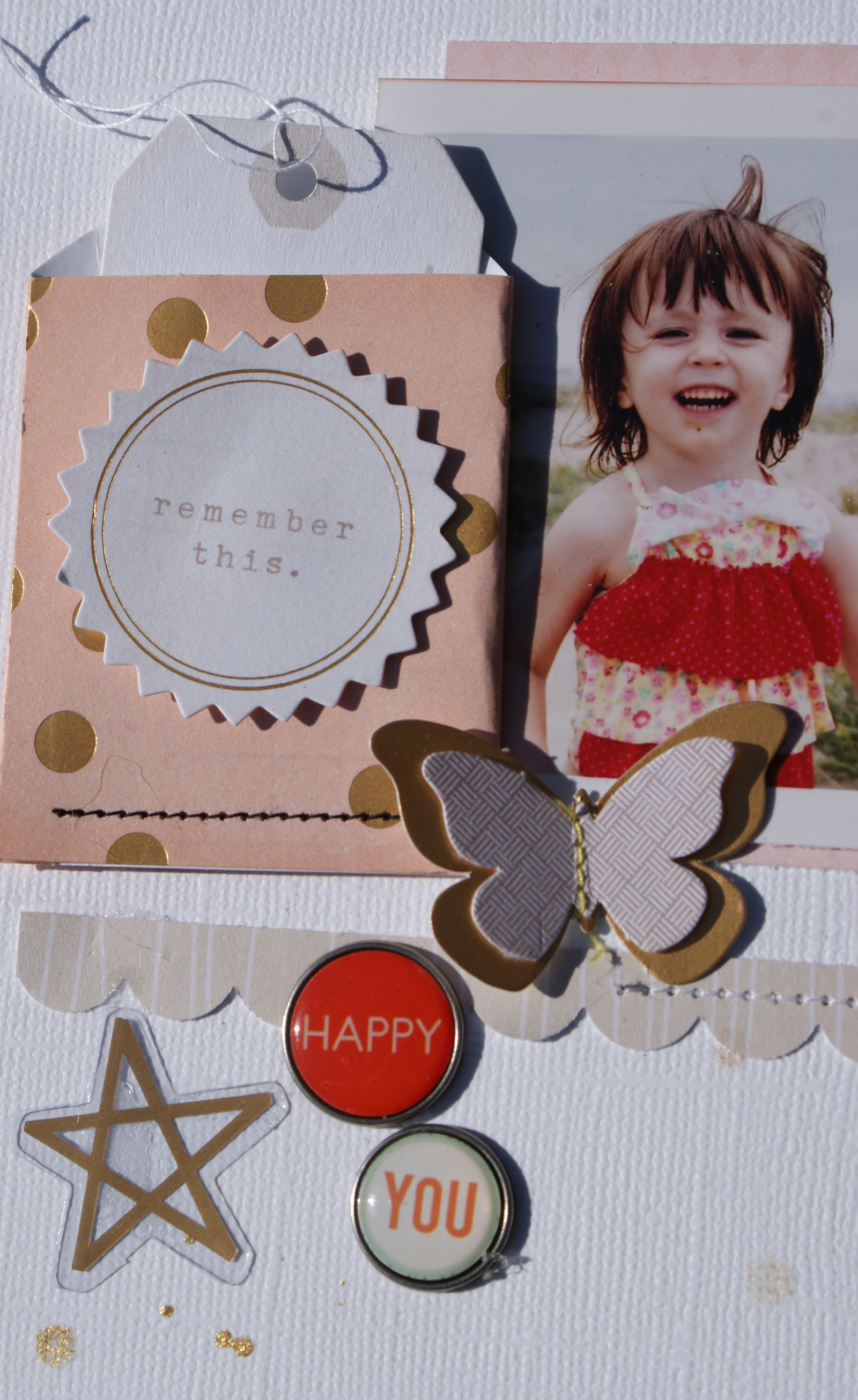
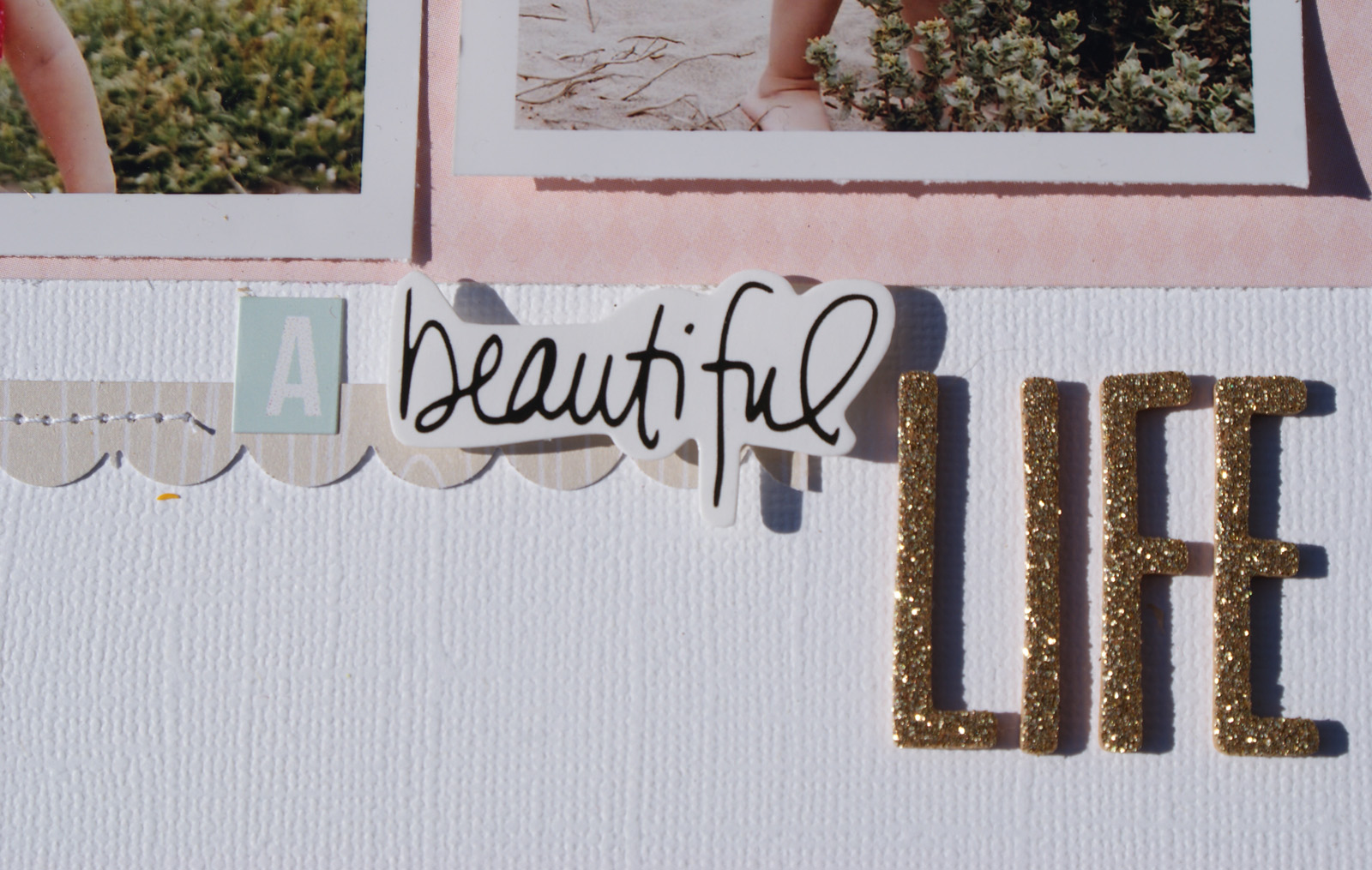
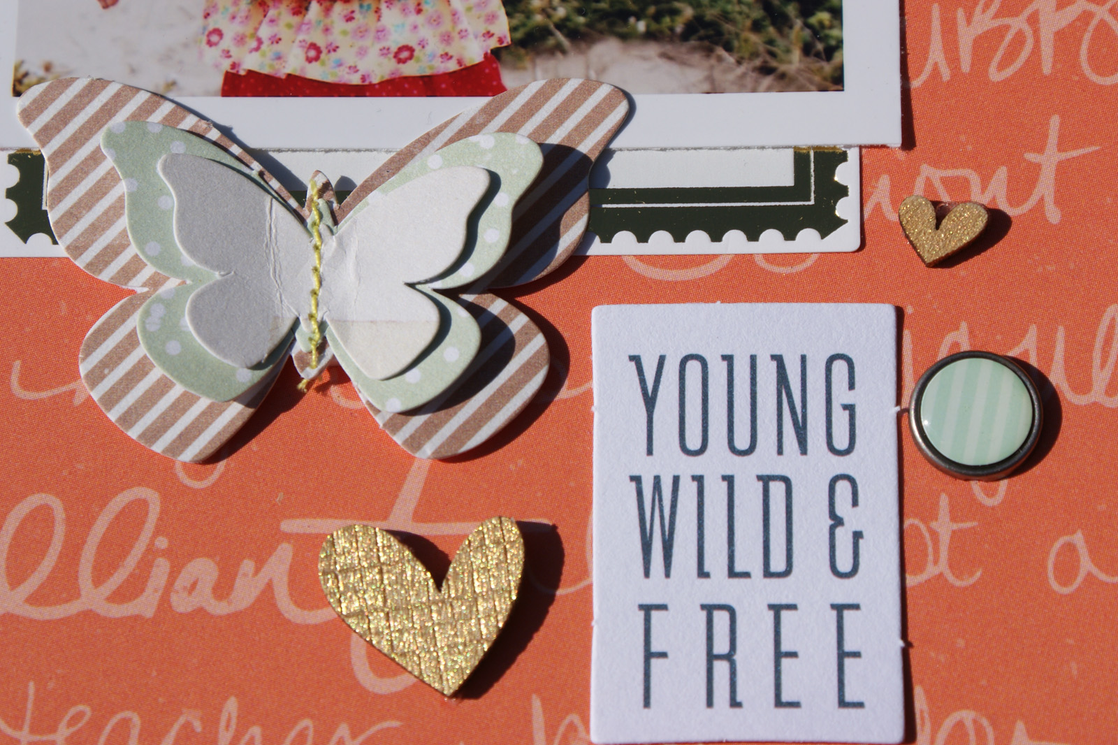
With the foundation of the layout completed, I turned next to embellishing. To make sure I balanced them across the two pages, I used the embelllishment to create a visual triangle. You can see that here in the finished layout.
Here are some closeups:
Products Used:
August 2014 All That Glitters Main Kit
August 2014 Summer Dreaming Embellishment Kit
August 2014 It Had To Be You PL Kit
August 2014 Little Bit of Sass PL Embellishment Kit
Wishing you a great day!



That is adorable! Great use of color and love your layered butterflies!!
ReplyDeleteso beautiful! I love how you showed the steps of how you created it. also, all the details you added are just lovely like the gold letters and the little pocket. great pictures too.
ReplyDeleteI really love this double page layout. It's so funny, but I started out only making 2-pagers and now I just can't. Maybe I will challenge myself to try to make one soon. Thanks for the awesome inspiration.
ReplyDelete